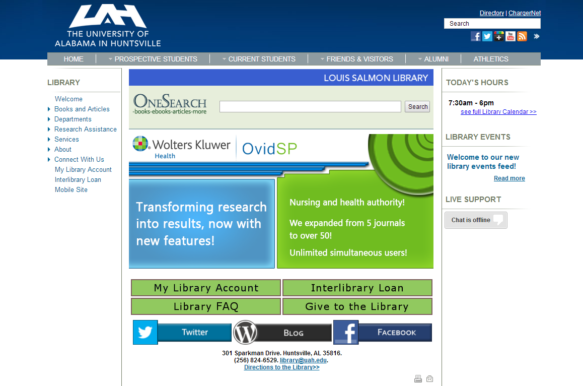
I was going to start this with the phrase “We have updated our website…” but I suppose I should be honest and say that I have tweaked the layout, so if you have any comments/suggestions/complaints, keep this email address in mind: doug.bolden@uah.edu. Now, with introductions out of the way, let’s take a look at the way the website looks now:
The big changes are pretty not-big, mind you, and are more about bringing certain types of information into easier, more-apparent, grasp.
OneSearch, which enables you to jump right into searching for the books and articles and ebooks and primary source documents and all the similar that you need, is now located in the middle of the page. That box might change appearance a bit in the upcoming weeks, but it should stay there. Over on the right, where OneSearch was, the daily hours now shows up. If you want to see more of the hours (for the week or upcoming month or the current semester), click the “see full library calendar>>” link.
There is also a new Library Events feed on the right. This will help keep you informed of planned events, class sessions, important news, and such for the library.
The social media links, and the direction/contact links, that were on the right, are now centered on the page. Social media sites are now sorted by actual interactive use (in which Twitter and then the Blog tend to outperform Facebook, at least for now). This is, of course, subject to change since social media is mercurial.
The buttons directly below the slide show will be tweaked to include a couple of more functions. They are a popular way to access our resources, so care will be taken to not disrupt too much.
Now, this is all in anticipation of the big change (see, it’s in bold, it must be big) coming to the campus-wide website this Fall. I am trying to get a few things prepared so that change will be a delight rather than a “Where’s the links I know and love?!” hindrance [NB: The interrobang is fascinating]. This is partially why we are getting some of the sections more thematically organized with an emphasis on persistent content into the center section and feeds/active-content on the right. The menu will likely stay 99% the same, though after the change it might be a tad different (hopefully in a reasonable way).
If you haven’t visited the website in awhile, I invite you to give it a shot.

