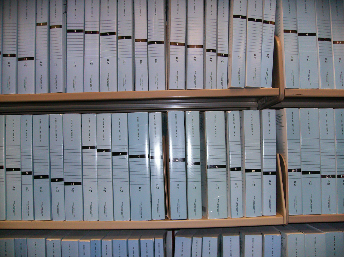
The other day, I was walking through our journal stacks on N1 (i.e., the northern bit of the first floor) and I spotted a delightful little oddity, which is best summed up in a picture:
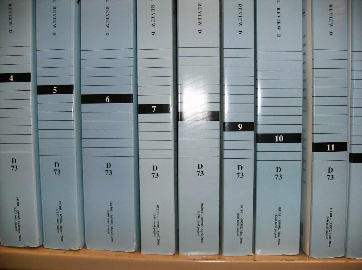
What you are looking at, there, is Physical Review D: Particles, Fields, Gravitation, and Cosmology*, published by the American Physical Society. For as long as we have original-binding print copies (about 20 years from the mid-90s through 2011**), they have persisted with the design choice of that color blue, with each issue being numbered in a bar that has been in the same persistent place so that the issue numbers cascade down.
A slightly closer look at it:
Being the sort of guy who works with design and around design, I can appreciate the rare glory that is a decades maintained design decision. I suspect this is the sort of thing that can exist more so in the world of academic publishing, where relevant regularly published content is literally the point, than in most forward-facing content, which has to invoke a sense of activity to convince people that the the same-old content is relevant (soda, for instance, keeps the same formula for years, but changes the can every year). I personally find it beautiful, and wanted to share.
I wonder if APS has a design bible they consult, a series of Pantone-complaint color sheets? I wonder who started the cascade, and if there have been design meetings about whether to change it?
A lot of book cover talk is aimed at flashy new covers and what they mean (and whether movie tie-in covers are brilliant or anathema) or how sunset-soaked acacia trees show an unfortunate trend in perceptions about Africa, but let us not forget the other side: some book covers are a process that began years ago and represent a simple permanence rather than playing to our expectations (often by feeding our own expectations and desires back to us).
Footnotes and Attributions:
* Impact Factor of 4.691. ISSN: 1550-7998 (print), 1550-2368 (online).
** Our physical range, including all the rebound volumes, goes all the way back to Volume 1 and our online coverage of the title covering the entire run.
The header is a joking reference to the Youtube video “The Expert”, about the design process and appealing to demographics [and ignoring the the expert in the room]. Did you spot the red lines drawn in transparent ink? The line-art kitten is used from http://princessentiafarms.deviantart.com/art/Free-Simple-Kitten-Lineart-289717626, with credit to PrincessentiaFarms.


